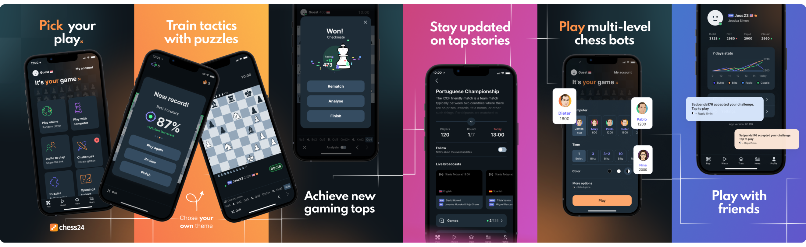
Chess24 had a strong engine and a passionate community behind it. But the experience let both down. Navigation was cluttered. Content was hard to find. Engagement dropped off fast — especially outside of active gameplay — and the platform felt stuck in an earlier era.
Rebuild the platform into six distinct experience zones, each built around a specific user need. Make it work for everyone: the traditional player who wants to focus, and the streamer who wants an audience. Web and mobile, consistent throughout.
I led UX and UI across both the web and mobile platforms, working directly with the product owner, art director, a junior designer, and the development team. Research, wireframes, visual design, prototyping, usability testing. I ran the whole design track, from the first interviews through to production handoff.
1:1 interviews with returning players and new ones. Google Analytics to map drop-off points. Competitive benchmarking across the major platforms in the space.
Built a primary user persona from the research. Mapped the platform architecture into six zones, each serving a distinct user need. Got the whole team aligned before touching the UI.
Web and mobile in parallel with shared components and design tokens. High-fidelity UI with motion design, then interactive prototypes pressure-tested before development started.
Usability sessions across six languages. Refined based on what players actually did, not what they said they would do. Delivered a production-ready design system.
Chess24 had a strong engine and community, but the experience felt disjointed. Conservative players found the interface overwhelming and cluttered. Streamers and younger players felt the platform lacked the features they expected: responsive feeds, daily quests, modern profiles.
Navigation was broken for non-English speakers, and there was a measurable drop-off after the first few games. We had to strike a balance — respect what long-term players expected while building features that would support content creators and drive real engagement.
Neither audience could be an afterthought. The redesign had to work for both.
I ran 1:1 interviews with returning players and new ones: casual learners, competitive players, and daily streamers. The same themes came up every time: unclear content structure, no obvious path to relevant videos, nothing pulling people back after those first few games. Behavioral data from Google Analytics confirmed the pattern.
The core user was pragmatic and task-driven. They wanted to improve at chess, follow the players they respected, and do both without friction. Everything in the redesign was calibrated to that person. Structure before flair, clarity before features.

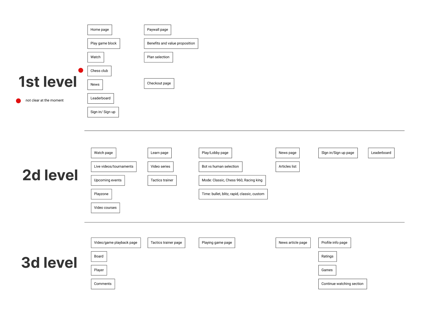
We restructured the entire platform around six distinct experience zones. Each zone serves a specific user intent, so no matter why someone opens Chess24, they land in the right place.
// Site map & navigation structure
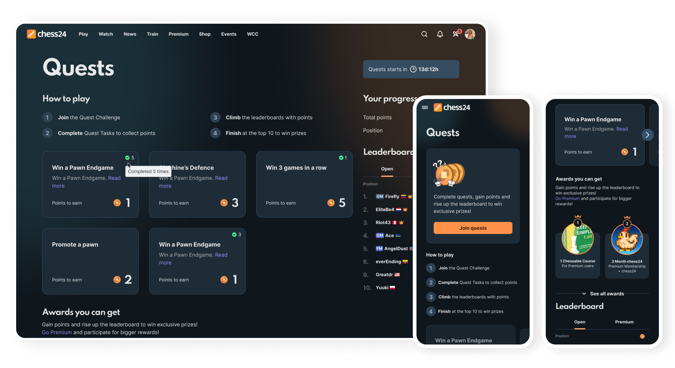
The platform had no reason to bring users back after a game ended. I proposed fixing that with daily quests and streaks — a lightweight system inspired by how Duolingo builds habit without being annoying about it.
Four quest tracks, daily tasks, and a streak system designed around how chess players actually think about improvement. It didn't try to turn the game into a mobile app. It respected the cerebral nature of chess while giving players a reason to come back more often. The data confirmed it worked. Traditional players, even the most conservative ones, responded positively to light gamification when it didn't feel like a distraction from the game itself.
Chess players use the platform differently depending on where they are. Desktop is for deep analysis and long sessions. Mobile is for quick games, catching streams, and keeping up with results on the go.
We designed shared components in Figma with consistent design tokens so core features worked identically across both platforms — then adapted the layout and interaction patterns to what each device actually demands.
Every one of the six zones exists on both web and mobile. No feature was ever exclusive to one platform.
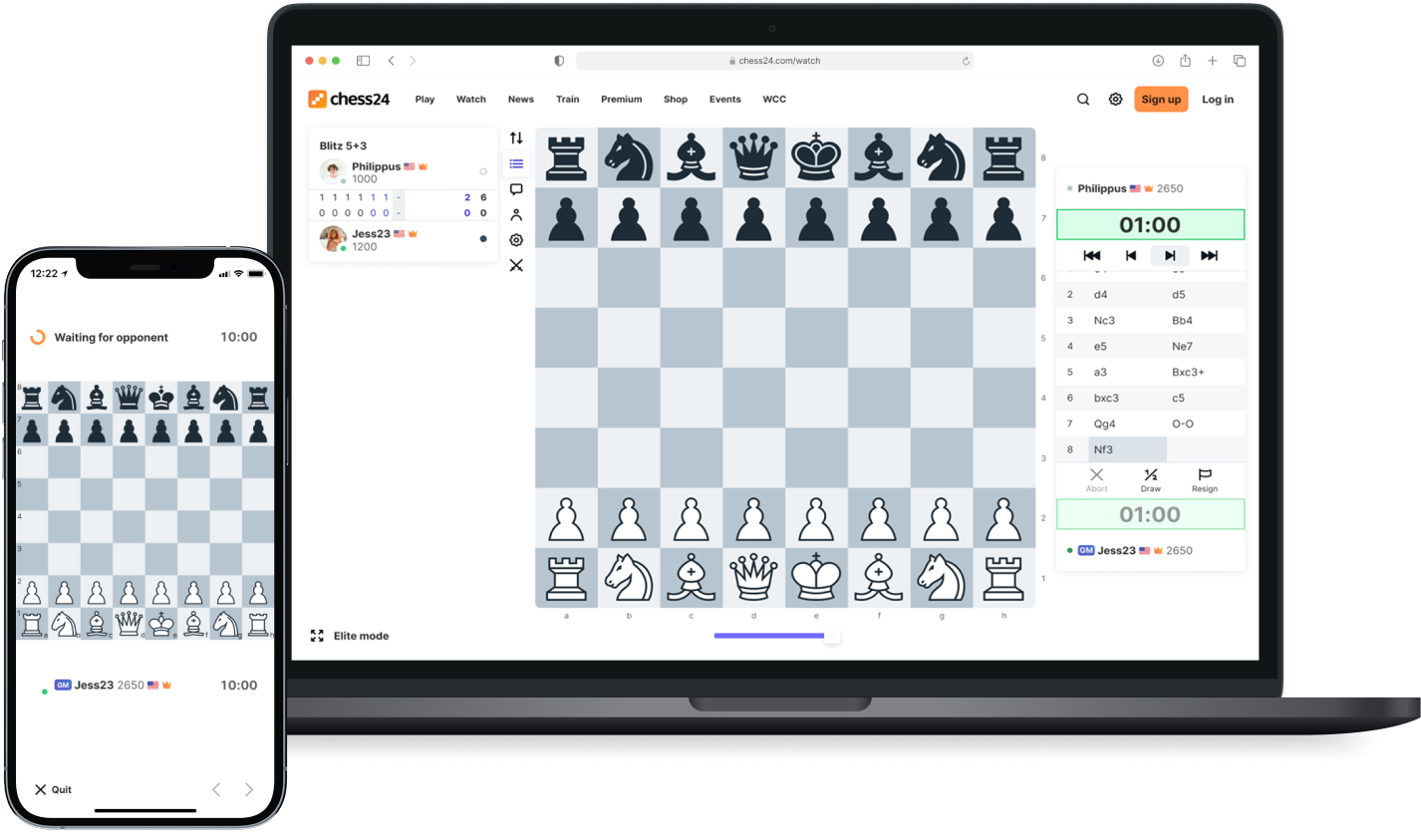
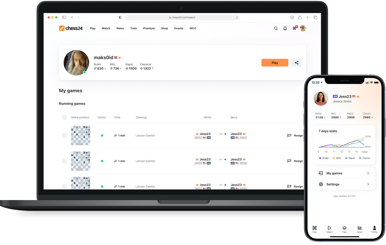
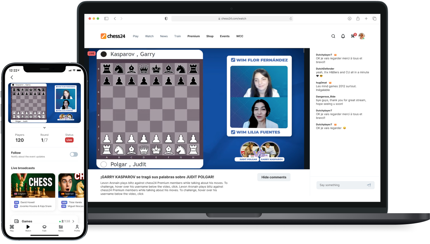
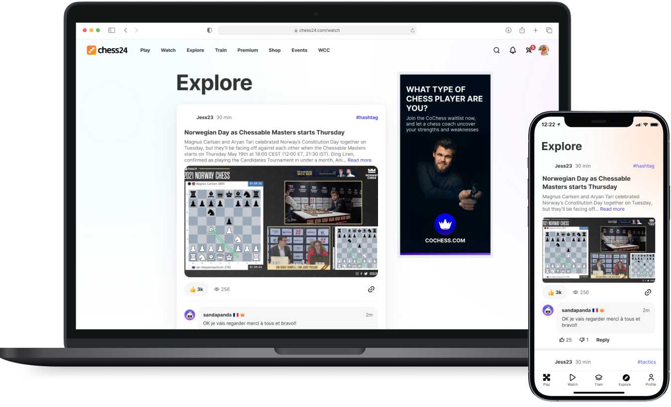
Every core experience lives on both platforms. Here's how the five most important zones translate across desktop and mobile.
Home — Play
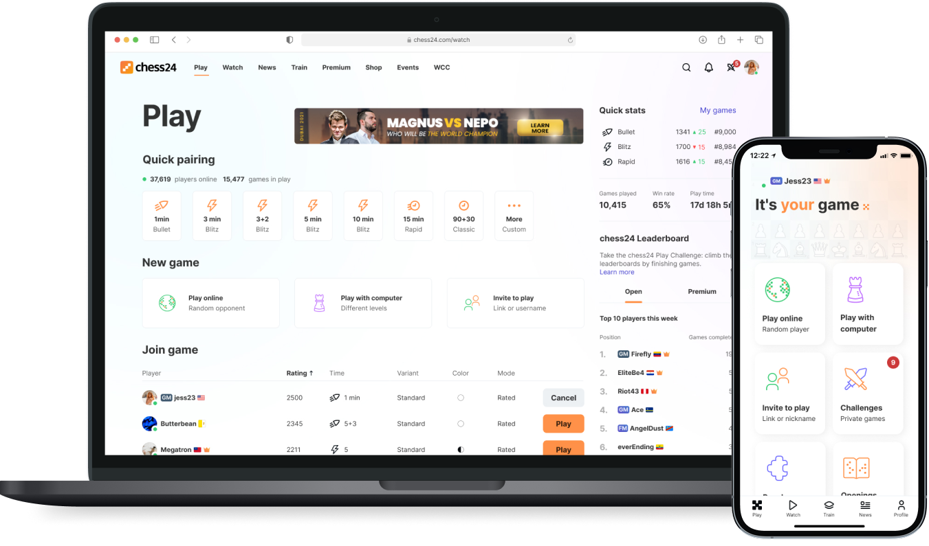
Game Zone
User Profile
Stream Zone
Feed — Explore
Retention improved through quests and streaks. Content became discoverable. Navigation worked for multilingual users for the first time. Streamers got the flexibility they needed. Traditional players noticed the difference on day one.
Designing for a diverse audience — from analytical chess masters to casual mobile players — taught me that respect is a design principle. Users who take their craft seriously respond to restraint. Small, considered features beat flashy visuals every time.
The quests system worked because it was honest about what it was. It didn't pretend chess was a mobile game. It met players where they already were and gave them one more reason to stay.
Cross-platform work also sharpened my thinking about context. The same solution doesn't always transfer. Staying adaptable — without losing consistency — is the real design challenge when you're working across devices simultaneously.
Chess24 needed structure more than it needed a new coat of paint. Splitting the platform into six zones gave every user a clear path, whether they came to play, watch, learn, or compete. For the first time, the platform felt like it was on the user's side.
Quests added a reason to come back. Consistent components across web and mobile meant the experience held together at every touchpoint. Better navigation meant the platform finally worked for users outside of English-speaking markets.
The numbers improved. But the thing that mattered more was this: Chess24 stopped feeling like a place to play and started feeling like a place to grow. That's the difference a considered redesign makes.