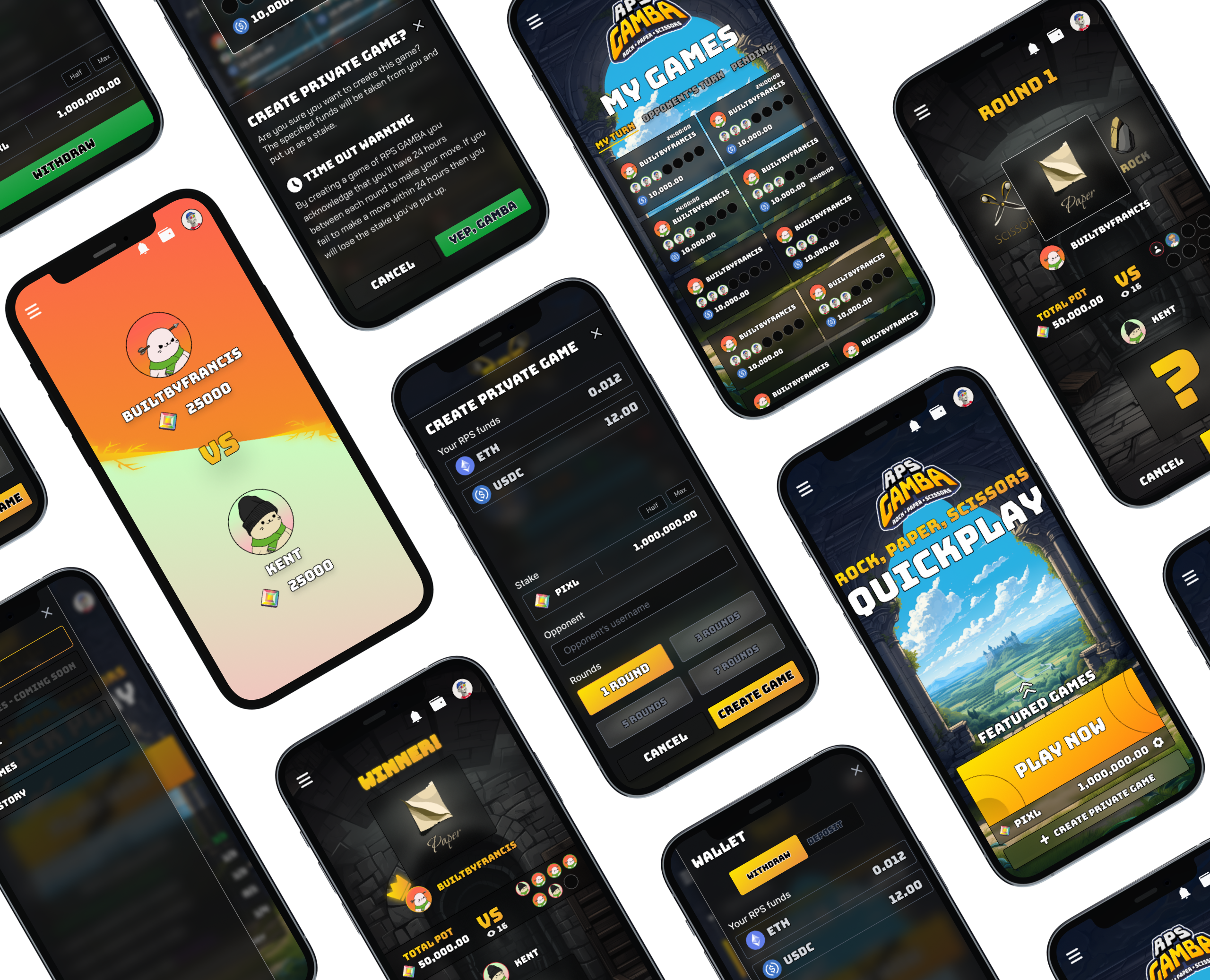
Blockchain games ask too much. Steep onboarding, endless wallet prompts, outcomes that feel opaque. Simple concepts end up feeling inaccessible, and players drop off before they ever place a wager.
Build a PvP wagering game that feels fast and fair from the first tap. Connect a wallet, pick a stake, play. Everything verified on chain, nothing hidden.
Worked directly with two engineers to shape and ship the whole product. Owned everything on the design side: flows, wireframes, prototypes, UI, motion, the design system. The goal was to make the blockchain feel completely invisible to the player.
Mapped blockchain flows and researched competing Web3 games. Found the same problems everywhere: too many steps, too little trust.
Built personas and ran MoSCoW prioritisation with engineers. Made sure we were building for players first, feasibility second.
Flowchart to wireframes to high fidelity UI. Then an interactive prototype walking the full wallet to wager journey before a line of code was written.
Usability sessions with real players. Refined based on what we saw. Delivered a design system ready for production.
Worked with engineers to map every blockchain interaction from the start. Researched what other Web3 games were getting wrong. Constant approval requests, confusing wallet states, unclear outcomes. Then designed around all of it.
Players needed fewer blockchain hurdles. Account abstraction was the answer: smooth play without signing every move. Pair that with clear wager states and transparent results and you get something people actually trust.
Sat down with engineers to define the MVP. Speed, trust, zero unnecessary complexity. Everything else could wait.
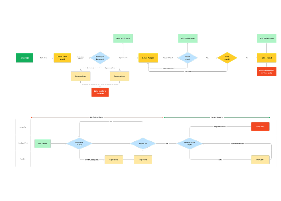
Before any pixels, we mapped every path a player could take: wallet connection, wager, result. The flowchart made it obvious pretty quickly where friction was going to show up.
It showed us where account abstraction was essential, where wager confirmations had to be crystal clear, and where results needed more visual weight. All of that got resolved before we touched the UI.
It kept design and development aligned on the same journey. No surprises in handoff.
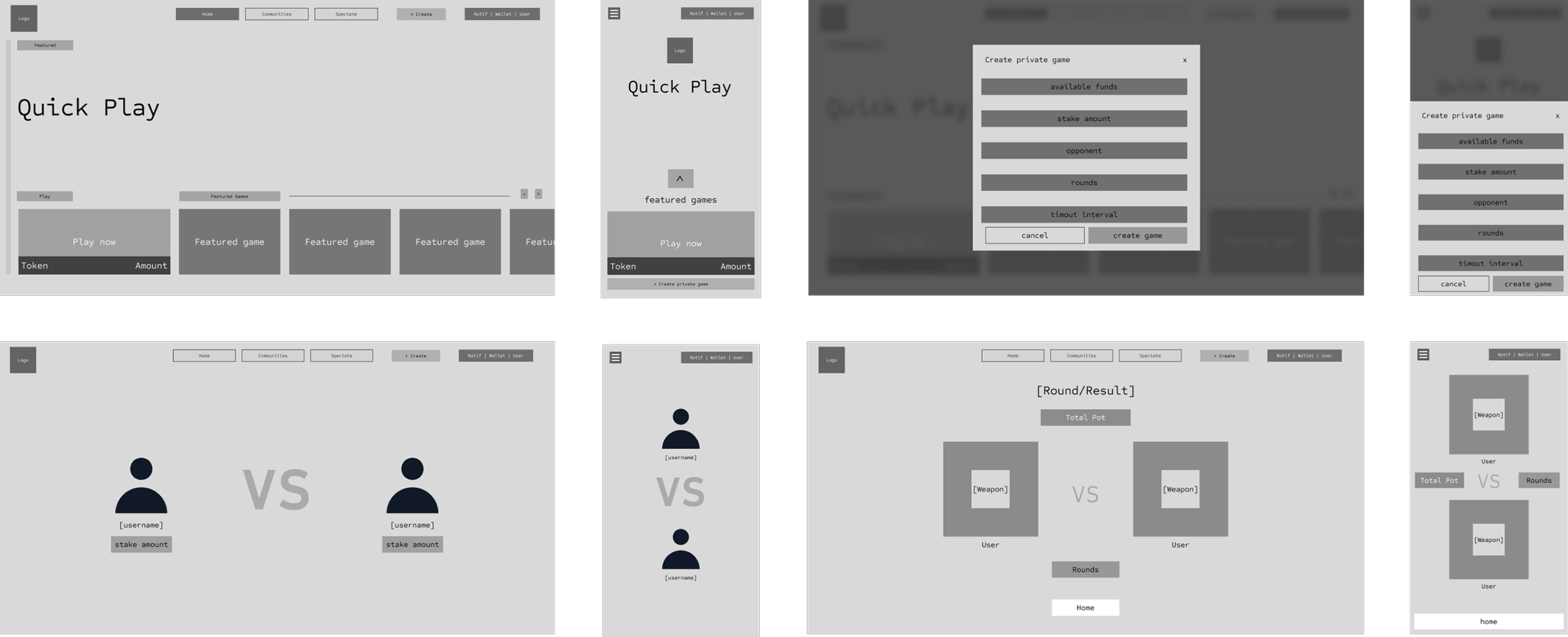
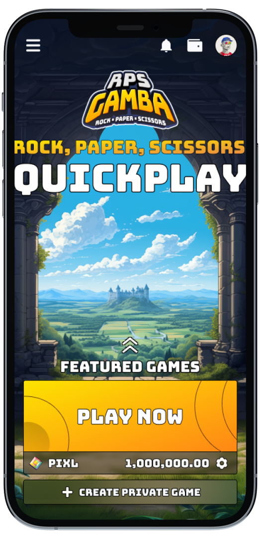
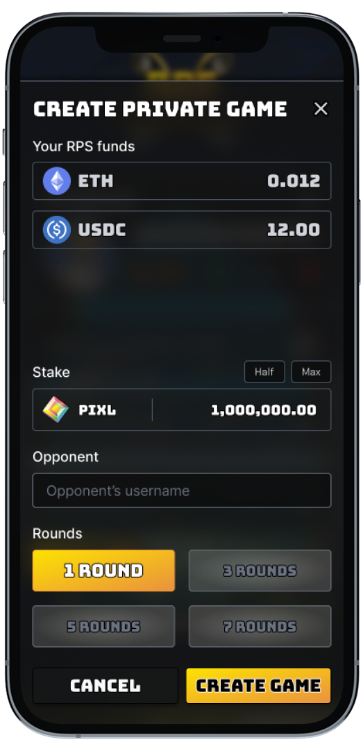
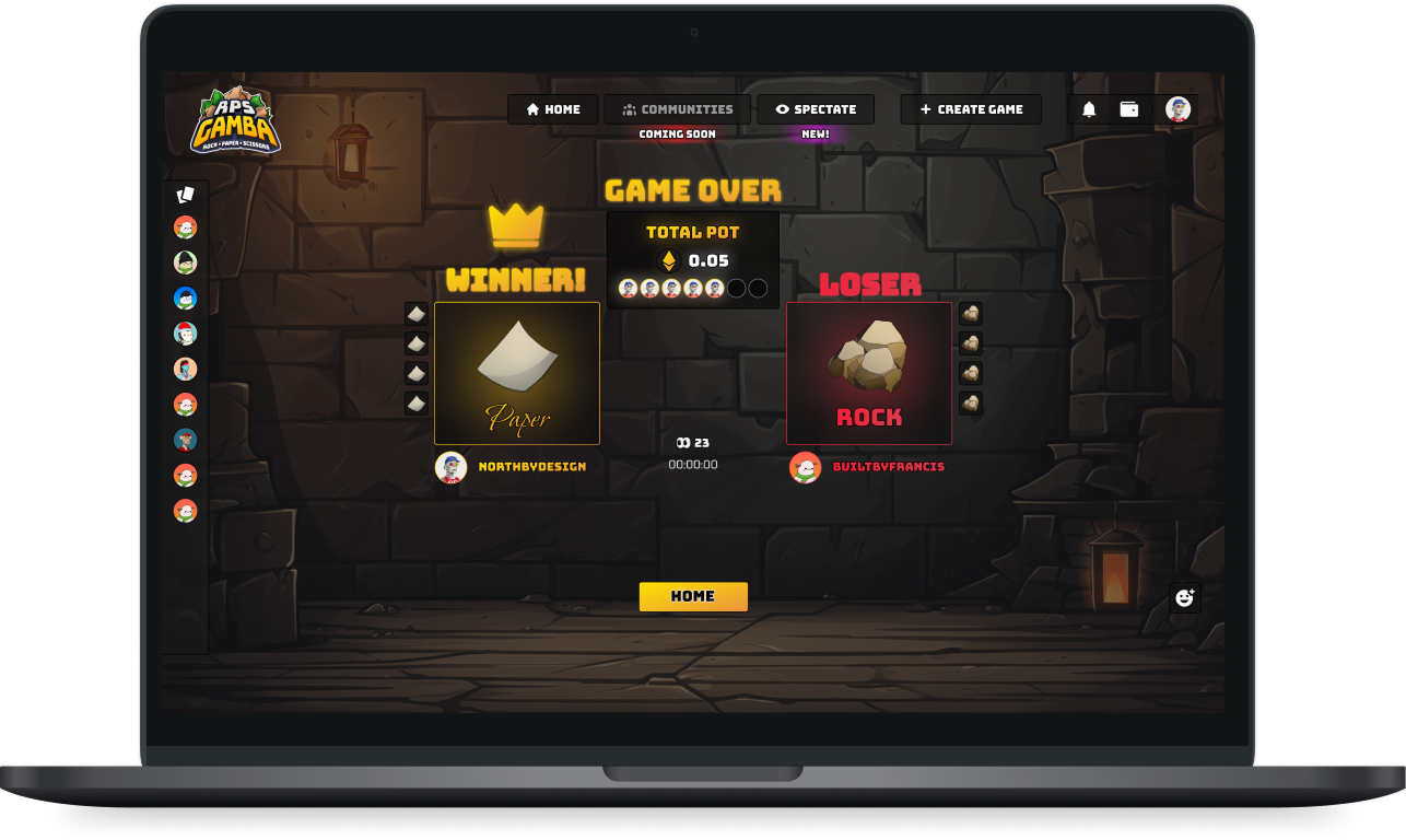
With a solid picture of what users needed, we moved into wireframing. Layouts for both mobile and desktop, all focused on getting players from A to B as quickly and cleanly as possible.
Iterative from day one. Drafts shared early, tested often. An interactive prototype let us pressure test ideas and catch usability issues before a single colour was chosen.
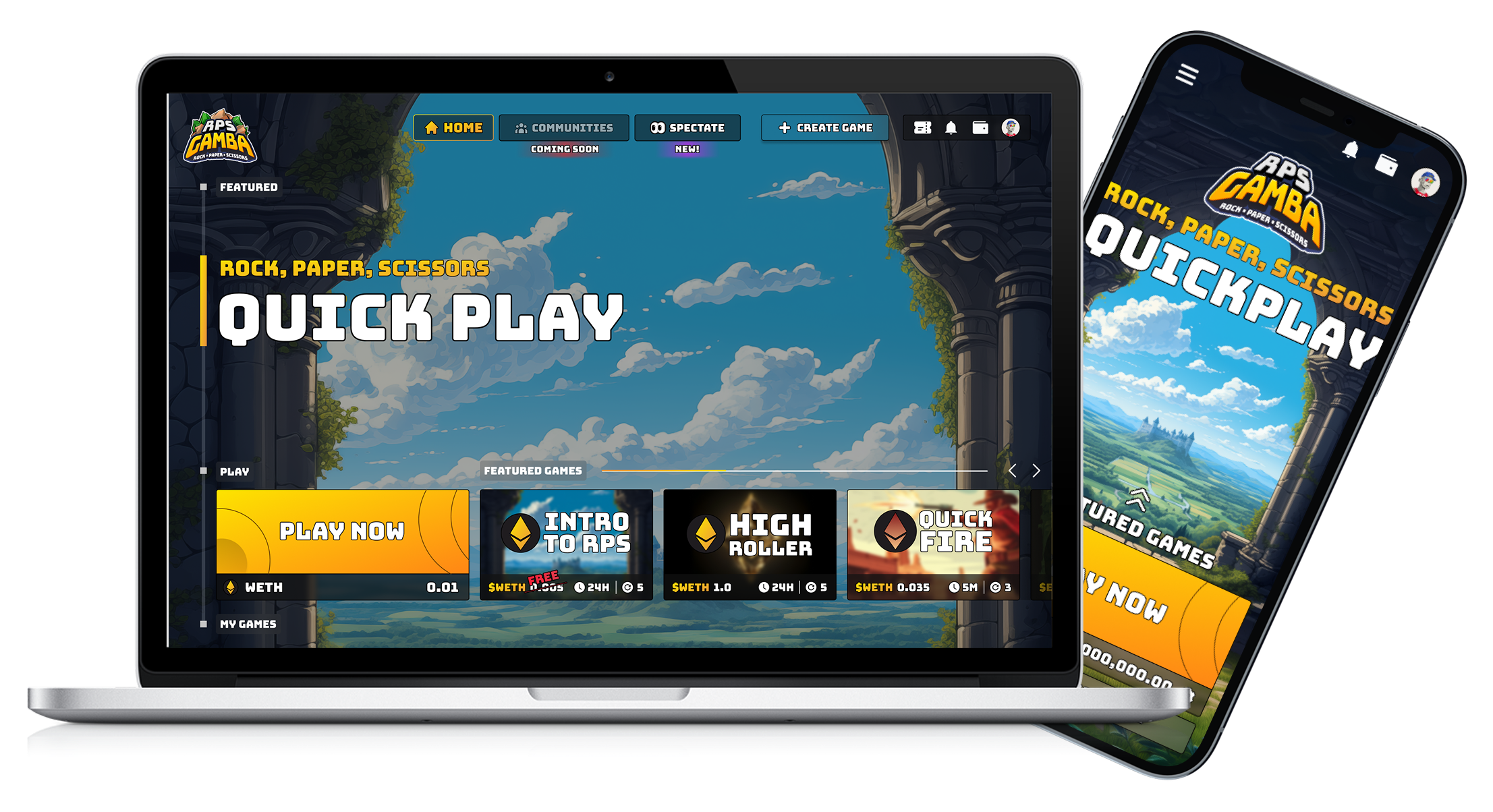
The UI needed to feel approachable and trustworthy without looking like a finance tool. Light, fast to read, and built to hold up under the pressure of a live wager.
Motion earned its place. Countdowns built tension. Win and loss feedback hit hard. Every animation had a job: guide attention or reward the player.
Consistent across mobile and desktop. Players always know where they are, what their wager is doing, and what comes next.
We built a design system to hold the whole product together, covering everything from wallet setup to match results. One consistent experience regardless of where a player landed.
Reusable components: buttons, wager cards, timers, status states. A shared language of colour, motion, and iconography that built trust without adding noise.
It also made development faster. Standard components meant fewer questions in handoff and a cleaner path to shipping.
1
2
3
1
2
1
2
3
4
5
Ran usability sessions using an interactive prototype that covered the full flow: wallet connection, joining a match, placing a wager, revealing a move.
The thing players noticed most was how account abstraction removed all the constant signing. Countdowns and wager states landed well. The result screen needed more punch though, so we went back and fixed it.
Every session tightened something. The result is a game that feels fast and fair whether you've used Web3 before or you've never touched crypto in your life.
RPS Gamba showed me how much a simple mechanic can demand from design. The moment you put real money on Rock Paper Scissors, every interaction needs to feel trustworthy and every state needs to be completely clear.
Account abstraction changed the feel of the whole product. So did spending real time on player testing before the build started. What you learn from watching actual people play is something no assumption can replicate.
Web3 products succeed when they stop showing off the technology and start putting players first. That was the north star on this project, and it shaped every decision we made. Those lessons around onboarding and transparency will carry into every project that comes after it.